From July to September 2018, signups for Interact went up 98%. It was the single largest increase we’ve ever seen, and since it happened everyone I’ve told has asked me what we did to see such a huge jump in so short a time, so I thought I’d share. (screenshot of new signups compared by date below).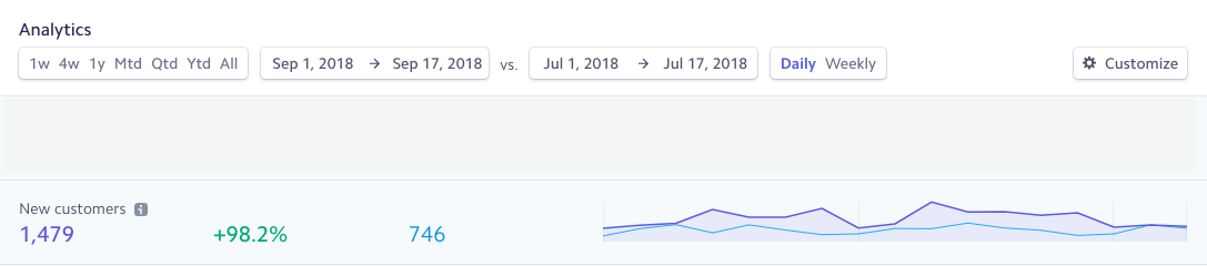
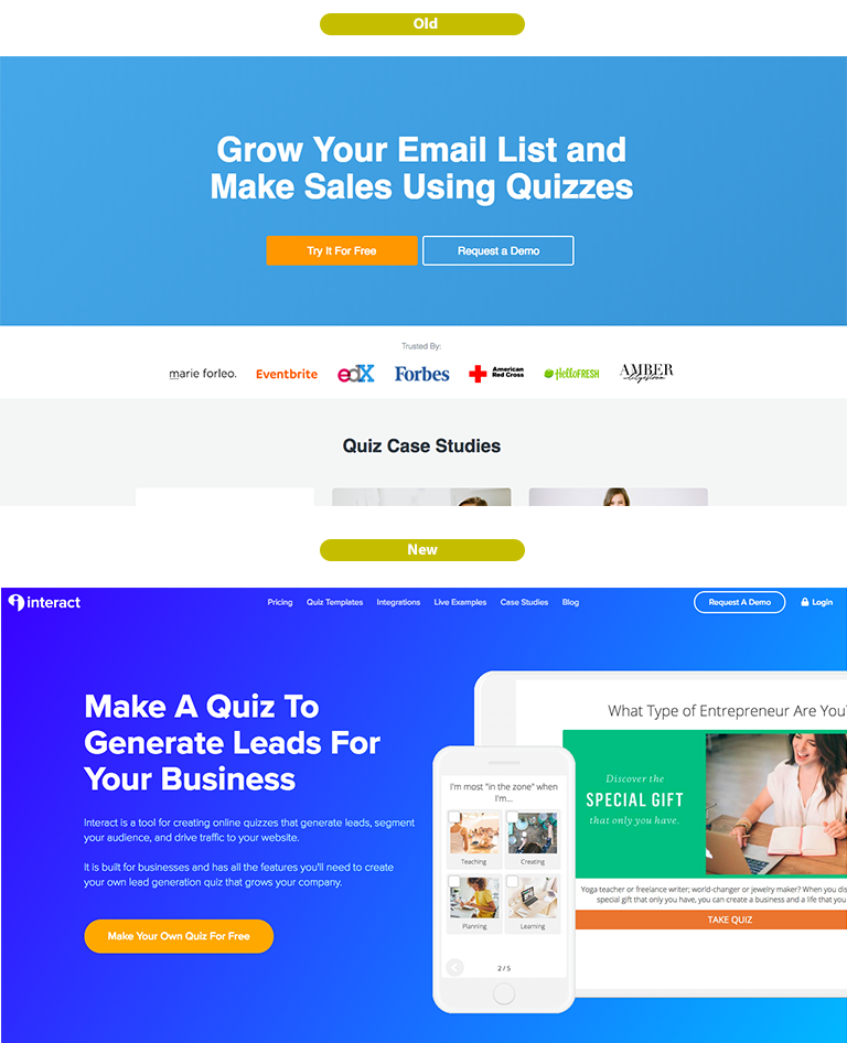
1. Moved to a long-form landing page with clearer CTA
We went to a super long-form home page in which we explained a lot of the new capabilities and features of interact so anyone interested could see a more detailed explanation of what they were getting into before signing up.
However, based on heat maps of the site that doesn’t really matter a ton, other than for SEO value (we wrote out the page following GrooveHQ’s SEO guide). Most people just click on the main CTA to sign up for free, which is totally okay because that’s where our customer journey typically begins regardless.
Conversion Rate Takeaways:
1. Have a Single CTA
You know the Jam Study? The one where they compared a table of jams for sale that had 24 options versus the same table with only 6 options? the one with 6 options sold 10x the amount of the one with 24 options. There are a ton of secondary studies about why we don’t like making choices between lots of options and things like that, but in general let’s just say that less is more and I believe one of the biggest impact changes we made was just going from two options “Start For Free” and “Request A Demo” to just one option “Start For Free.” We still have the demo request option on the page, it just doesn’t compete with the main CTA.
Make Your CTA A Verb. Our old CTA button said “Try it For Free” but what is “It”? you just landed on this site and now I’m supposed to try “It”? what does that even mean? (I can rip on this copy because I wrote it). We changed it to “Make Your Own Quiz For Free” which is what you actually get to do when you sign up.
If you have Free, just say it. When we first launched the new site the button said “Make Your Own Quiz” which was good because it was actionable, but it didn’t say “For Free” when we added that back in it increased signups a good 10-15%. If you have a free option just say it, I was always afraid that people might try to take advantage of the free option instead of paying, but that is a product issue if you don’t have your freemium options well thought out so people naturally upgrade as they increase usage.
2. Write for search engines
I know this sounds out-dated in 2018 when we’re supposed to be designing for people, but I argue you can do both. Like I mentioned, most people just click on the one main CTA on our site anyways, so that’s the part designed for our fast-paced-just-let-me-try-it world, but below that is where the real magic happens for Google. Your headline and one button might be enough for people to understand what you do, but Google isn’t that intuitive, you need to spell it out. Again based on that Groove guide here’s how we set ours up.
-Choose one main keyword with the highest traffic “Make A Quiz”
-Choose secondary keywords for your page sub-sections “Create Quizzes, Quiz Templates, Lead Generation Quizzes, etc.”
-Work both primary and secondary keywords into site body text
I didn’t force this, we just made an outline of the site and made sure the words were included where needed without disrupting the flow of the copy. The main goal was still to inform people about our product offerings and how it’s useful to them but we just made sure to have the right words in there so Google knows what we’re up to.
3. Optimize for Mobile
After the new home page was pretty much done we spent an additional two days optimizing for mobile. Google is putting a huge emphasis on mobile-friendliness, and created this tool to check your page load speed on mobile devices because they are taking it seriously. Even if most people visit your site from desktop they still take this into account when ranking your site.
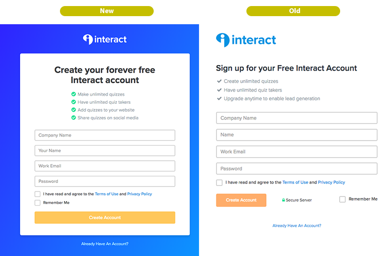
2. Updated registration page to clearly show free options
We updated the copy on the registration page to state “forever free” instead of “Free Interact Account” because people have been too often burned by freemium products that pull the rug out from under them and delete free accounts later. I got this idea from Wistia and Mailchimp, both of whom have “Forever Free” Accounts. The thing is that when someone is creating a free account this is the beginning of their relationship with your company and they want to know that there is going to be honesty all around. Let them know what they’re getting into and that you aren’t going to try and switch the script later on.
Conversion Rate Takeaways:
1. Be honest with what you are offering.
Whether you have a free plan or not, be up-front about what the person signing up is getting into. If it’s a trial then outline the terms of the trial and what happens if they decide not to convert and pay, if it’s a paid account let them know what the return policy is. There’s no sense in hiding behind ambiguity when people don’t know you or trust you yet, start things off right by being open on your side.
2. Highlight the benefits, not the drawbacks
In the bullet points on our old signup form it said “Upgrade anytime to enable lead generation” which is a limit, not a benefit, of the free plan. We clearly outline all the prices including the free plan on our plans page, so there’s not really a need to talk about this here. Even if you’re selling a “free” product, always focus on why it’s got merit in and of itself.
3. Added “Built With Interact Quiz Maker” to free quizzes
We used to have “Powered By Interact” links on free quizzes within the embedded iframes, but then we moved them outside the iframe for SEO purposes because that used to be effective. However, Google phased out the authority of widget backlinks and we listened by removing that tactic. However, then we weren’t putting any sort of branding on the 50,000+ free interact quizzes that are out there getting viewed a lot.
So we put “Built With Interact Quiz Maker” on all free quizzes and it links to our signup page, and these links aren’t followed by Google, it’s simply for branding purposes.
Traffic from this branding quickly jumped into third place for interact signups right after direct and Google traffic.
Conversion Rate Takeaways:
Widget links don’t work anymore for SEO, but that doesn’t mean that branding can’t lead to signups. If you have co-marketing opportunities or free products, work with your users to see if there’s a way you can partner together to let people know where the content came from.
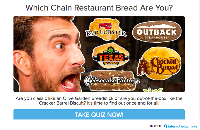
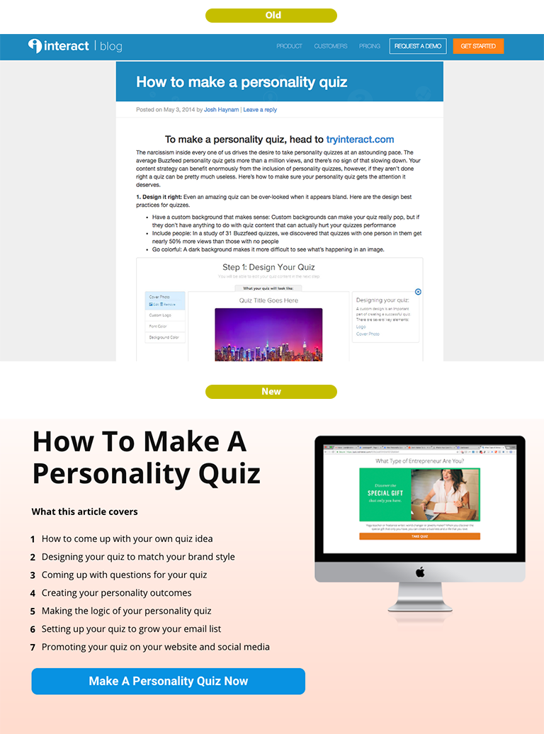
4. Added 30+ new landing pages over high traffic tutorial blog posts
Backstory: The way interact got started was because we did posts like “How to make a personality quiz” and “How to make a style quiz” for every single type of quiz we could think of. In 2013-14 when no one was doing quizzes for marketing like they are now, this was the only way anyone found us and signed up. Over the years those blog posts continue to be one of the main drivers of signups for us and we added more and more tutorials.
Over the last few months I turned a lot of those posts into Leadpages as a way of practicing for what I wanted to write on our website home page. The original intention was to learn what kinds of things resonated and track conversions. However, it started working and I could see that the tutorials would drive 1,2, sometimes up to 10 signups a day per tutorial so I just went ahead and made a bunch of them.
This is honestly the single biggest reason for the massive increase in signups. The conversion rates on these blog posts more than doubled after switching the format to Leadpages, and using their WordPress plugin I could just publish them over the same URL’s without losing any Google traffic because of it.
Conversion Rate Takeaways:
1. Turn high-traffic tutorial-type blog posts into landing pages
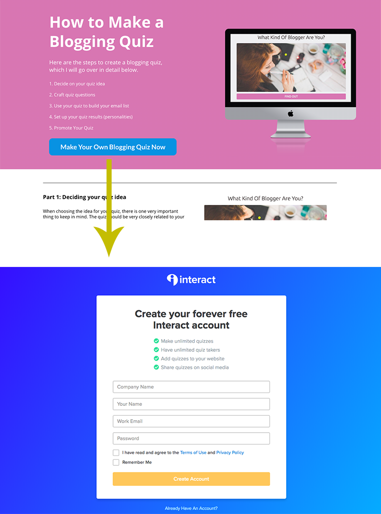
This is what some might call “Landing Page Strategy” which is something I’ve heard talked about a lot. I never really knew what it meant, and what stuck in my head was this quote from HubSpot that basically says “The more landing pages you have the more signups you get” (Blog Post) I never had an application for that but now it makes sense. The landing pages are like copies of your website home page but adapted for the very specific thing people are searching for. I.E. “How to Make a Blogging Quiz” with all the personalized recommendations for creating a blogging quiz you can imagine in a long-form post that is turned into a high-converting lead page.
Replicate that for every tutorial you have that addresses a specific, close-to-your-core-product offering term you have a post for, and watch the leads increase.
Link directly to signup. Another important note is that since these landing pages already have a ton of explanation on them, you don’t need to link to your home page, you can go directly to the signup page, which decreases the options and increase conversions.
5. Pointed signup links directly to free registration page
Once I realized the power of linking directly to signup from our landing pages, I started doing it all over the place, on our powered by links, on our templates and examples pages, on other blog posts, etc. This creates a singular flow for how people get started with our product and reduces options for getting lost along the way.
Conversion Rate Takeaways:
Consider your signup funnel and determine the highest-converting first opt-in option, whether that’s a free signup, starting a trial, etc. MOZ has been doing this for years, and I used to think it was strange, but given how people sign up for that product (mostly through blog content), it makes a lot of sense. This probably doesn’t work for all kinds of businesses, but in situations where you are doing a lot of education before asking for any sort of signup it can reduce friction.
6. Started blogging 4x a week
I have an image burned into my mind of a traffic screenshot from The Everywhereist that show like 3 years of basically no traffic and then a “sudden” spike into 100k+ visits per month. I’m always tempted to forget this, and it seems so much easier to find a new hack or implement some new system than to create 2-3 quality, thought-out pieces of blog content every week.
It’s super difficult, it’s my full-time focus right now and I hope to give it a real run to see what happens if we actually continue consistent blogging for a few years.
However, even in just a couple of months we’ve already seen the impact of consistent blogging. Since most content created on interact isn’t crawl-able by search engines, they honestly looked at our site and thought it was dead because not much ever got updated. Since publishing 4 times a week the last two months that has changed and our Google traffic has spiked. I’ve put a screenshot below, it might not look that insane but when things had been pretty flat for a long time before that, seeing clicks jump from around 550 a day to around 850 a day is a huge gain.
Conversion Rate Takeaways:
Create content consistently with caveats. Yes, it is helpful to post consistently, no, it is not helpful to post 300 words about your rant for the day consistently. Before committing to blogging again I had to set out a strategy, and it looks like this.
-Post 4x a week
-Every post must be over 2,000 words and include several studies in it
-Have a revolving mix of tutorial-type content, marketing strategy content, and interact case studies
It’s not much, but it’s a commitment to quality and uniqueness and prevents me from slacking off and publishing 800 words of garbage each day in an attempt to create “fresh” content. It does matter that you publish consistently, but it also matters that you don’t suck.

In Conclusion:
It blew me away that some “small” changes like what I showed above could increase our signups nearly 100% in just a few months, we worked for years to create our product and the content surrounding it, we established a network of partners who work with us, we painstakingly onboarded every customer, we toiled to create a product that’s easy to use, and I don’t mean to take away from any of that effort in any way through this post. All that hard work laid the foundation for these few tweaks to really click everything into place and shoot us off into another dimension. If you’re feeling like you’ve done all the foundational work these tips might be helpful to you, and if you want to check out interact and see it all first hand, feel free to click here.