In what seems like an instant, someone can determine if they’re attracted to your brand and if they want to buy from you. And what does this often come down to? Your design.
Humans are accustomed to making split-second decisions on whether or not they like something based on its appearance alone.
That’s why design often determines the first impression of your brand rather than the words you say. The same is true for your quiz design.
If you’ve already decided to create a quiz (good choice!) but have been stuck on where to go with the design, you aren’t alone. Here’s what you can expect in this article:
How to design a quiz:
- Choose a visual theme for your quiz
- Use color theory to influence your quiz design
- Create essential visual elements for your quiz
- Select the right typeface and font pairings
- Include an eye-catching cover image
- Decide on question and answer images
- Make a positive impression with result images
- Put it all together with quiz design templates
We want to help you create a personality quiz that makes a big impact, and it starts with designing your quiz with your target audience in mind.
How a quiz looks is just as important as how it functions, but creating a visually stunning quiz doesn’t happen on accident. It’s created on purpose for a purpose.
No matter if you are using a quiz to recommend your products, promote your services, grow your email list, or simply share educational content with your audience, your quiz design will help you create a memorable experience for everyone who lands on your quiz.
So, let’s start with the first step: designing a unique visual theme!
How to choose a visual theme for your quiz
Before we get into the nitty gritty details of designing your very own quiz, let’s take a moment to identify what kind of visual aesthetic you want to incorporate into your quiz.
Visuals matter–not only because they look beautiful, but they’re also our most effective mode of communication. Did you know visuals communicate with our brains 60,000 times faster than text? This number is so big that it almost seems made up, but it’s true. Around 90% of the information your brain takes in is visual.
With our brain’s natural emphasis on visuals, it’s no surprise that we recommend focusing your attention on following a visual theme to enhance your quiz design.
But first thing’s first. The visual theme of your quiz needs to immediately resonate with your target audience. Your quiz design should be created to attract them, not yourself. It’s good to keep your quiz design on-brand, but your visual branding should have been crafted to reflect your audience’s desires and preferences anyway.
Note: If you haven’t created a visual branding style guide or designed your logo, we recommend doing that as soon as you can. It will anchor your quiz design and any other designs you create from here on out.
The best way to cater your quiz design directly to your ideal audience members is by choosing a visual theme they’ll gravitate toward and identify with.
Let’s see how this works in action!
Take these two Interact quiz creators, for example. Jen from TONIC Site Shop and Elizabeth McCravy are both designers who sell web design templates through their personality quizzes. You may think because of their similarities, they probably have the same kind of visual aesthetic. Think again!
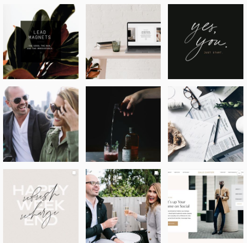
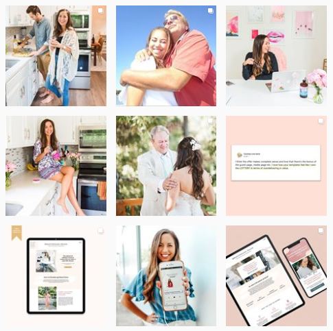
From looking at their Instagram feeds, you may notice Jen’s feed is a little dark and moody with high-contrast images and neutral colors, while Elizabeth leans toward casual imagery with a day-in-the-life feel, complete with vibrant pops of blue, pink, and more.
Both website designers are trying to attract different audiences with their marketing, so it makes sense for their social media feeds AND quiz designs to look different.


Seeing the examples above, it shouldn’t be difficult to determine which website designer created each quiz design. This is why the experts say consistency is key!
As you determine which visual theme you want to move forward with, remember, you may have different preferences than your audience does. For example, if you love bold, neon colors but your audience leans toward soft, neutral colors, you may need to shift your quiz design to fit their needs.
If you aren’t sure who you are trying to attract with your fun quiz, take a moment to define your customer personas. This will help you get a better idea of who your target audience is, right down to their habits, motivations, preferences, interests, and more.
Recommended Tutorials: How to Create Customer Personas for Your Personality Quiz
Once you create customer personas for your brand (using the exercises in the article above), you’ll be one step closer to creating a more attractive quiz design for whoever you ultimately want to connect with and convert.
An easy place to start is by understanding the most popular visual themes that already exist in the world of quiz building.
Masculine vs. Feminine vs. Gender Neutral
First, ask yourself if it makes sense for your quiz to attract a specific gender based on who your target audience is. If so, you can choose a more traditionally masculine or feminine style. If not, you may want to stick to gender neutral design elements when it comes to choosing colors, fonts, and other visuals.
For example, Rick Mulready created a Facebook Ads Superhero quiz to attract more quiz takers in his largely male audience of marketers. Tying in a relatable superhero theme helps this pop culture quiz stand out. When someone takes the quiz, they’ll also see stock photos with men featured in them, reestablishing who Rick is trying to attract.

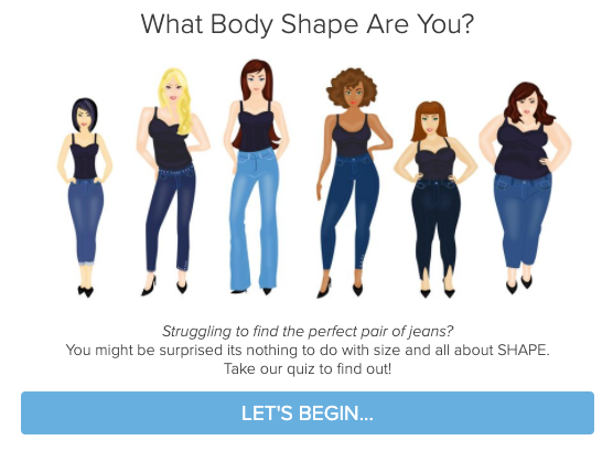
In contrast, the creator behind ILoveJeans.com uses a personal assessment quiz to help women identify their body shape. With the female illustrations below, it’s easy to see this quiz is geared toward a female-only audience. Pursuing a more feminine visual theme here makes sense.
Lastly, Lewis Howes decided to create a quiz that helps his audience members determine if they have a profitable business idea. Since this topic is gender neutral, it makes sense for the rest of the visual theme to reflect this, too. He has a fairly balanced audience of men and women with entrepreneurial spirit, so this style of quiz is the perfect fit for his brand and target audience.

Corporate vs. Whimsical
Have you ever noticed that major corporations typically have a visual aesthetic that looks, well, corporate? Structured visual style guidelines and an overall buttoned-up, professional look usually define this kind of aesthetic.
If this style fits your growing company, you may lean toward a corporate style. If you want to let your hair down and have more fun, you may want to incorporate a more whimsical look.
A whimsical visual theme will give you more creative freedom to include fun illustrations, pop culture references, GIFs, and more. You can throw out the rulebook with a whimsical look, but corporate visual themes will usually have guidelines you need to follow.
Think first about the kind of vibe you want your quiz to have and what your audience will respond well to. Then you can use this knowledge to create a better quiz design.
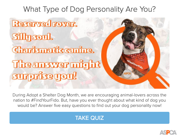
For a more corporate-looking example, ASPCA created a dog personality quiz that features their logo multiple times. It also shows their brand colors with a mention of a corporate-wide hashtag they used for their Adopt a Shelter Dog Month marketing campaign. This is a nice example of a nonprofit organization who stuck to their visual branding guidelines but also had some fun with their quiz.
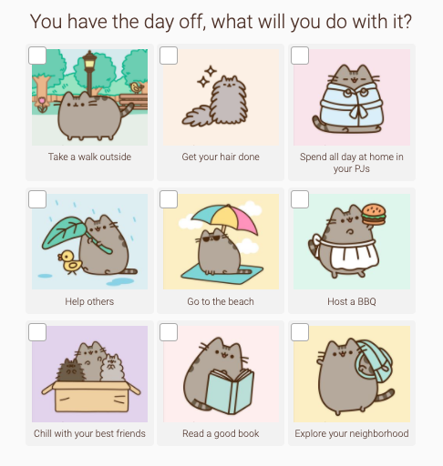
Whimsical visual themes can take many forms, but we especially like how Pusheen’s quiz turned out with their adorable illustrations and characters. Their quiz design matches their website and other marketing materials perfectly. It includes just the right amount of charm and whimsy to become memorable. Since they have a younger audience, it makes sense for them to choose a more whimsical visual theme that’s relatable.
Relaxing vs. Energizing
Speaking of the vibe you want to create with your quiz design, think about if you want the quiz to feel like a blissful retreat from the demands of daily life or if you want it to empower your audience members to work on the projects and things they love. Do you want the visual theme to have a relaxing or energizing feel to it?
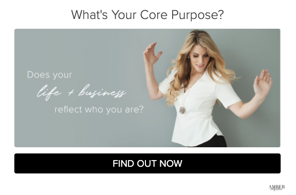
Amber Lilyestrom created a personality quiz to help her audience find their core purpose while reflecting on what their life and business currently looks like. This topic has a relaxing tone to it, along with the muted blue photo background and slow cursive fonts.
In a more energizing example, we love how Courtney Elmer used a stock photo to show someone planning their day and checking off their to-do list. She also titled the quiz “What’s Your Productivity Personality?” which speaks to a topic that produces more energy than relaxation.

Trendy vs. Timeless
One of the last visual themes we’ll cover is the difference between a trendy or timeless look. Trends are styles that come and go quickly, but timeless styles stand the test of time.
If you are hoping to build a fun quiz to help you launch a new product or service, a trendy visual theme may work well, as long as it still fits within your visual branding. It might also be a good visual theme for your brand if you teach on a trendy topic.
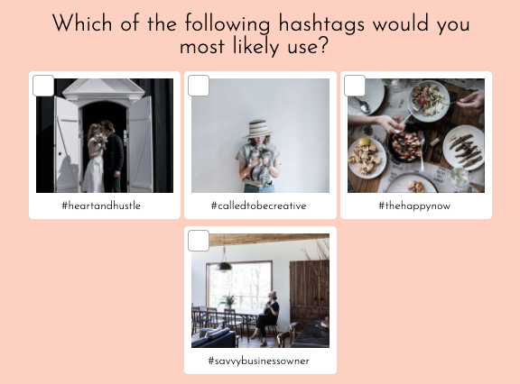
This style works for Beth Kirby since she is a social media content creator who teaches others about hashtag strategies. In her Instagram-themed quiz, it makes sense that she uses a trendy style with beautiful styled imagery, pastel colors, and even timely hashtags. She may have to update the hashtags over time based on their popularity, but it keeps her quiz fresh and exciting!
However, if you hope to turn your quiz into an evergreen sales funnel, you may want to use a timeless look that doesn’t need to regularly be updated. That way you can set up the funnel once and let it run on autopilot.
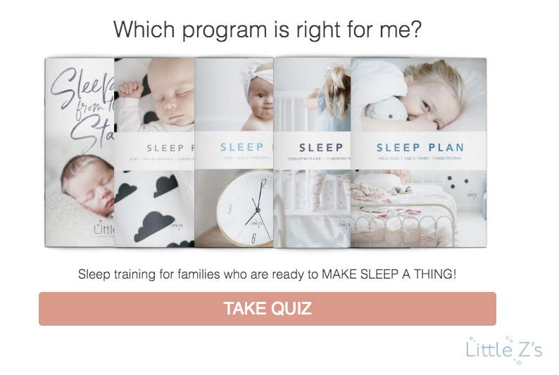
This is the strategy many of our quiz creators use, like Becca of Little Z Sleep. She created a product recommendations quiz to suggest various sleep training programs her audience may need. Her design is timeless, allowing her to convert more customers.
Now that you have a better idea of what visual theme you may choose, let’s think about the colors, fonts, and other visual elements you may want to bring into your quiz design.
Using color theory to influence your quiz design
Have you ever noticed how colors evoke different emotions?
When you see a shade of red, it may instinctively tell you to stop or take an urgent action. The color blue, however, may remind you of calm bodies of water.
Marketers use this knowledge of color theory to influence the way you view their brand, whether you realize it or not. You can utilize the same principles to create a better DIY quiz design, but first, let’s understand the common emotions and meanings behind each color.
Understanding the meaning behind each color
How do you go about choosing the right set of colors for your quiz design?
A great place to start is with this simple five-minute exercise. We will walk you through the prompts step-by-step so you can identify the vibe and style of your brand before we even address color preferences.
Let’s begin by listing five to ten words that accurately describe the kind of experience or product you want your brand to be known for. Then, you can make a similar list of adjectives that describe how you want your audience to feel about your brand. You can do this on a simple sheet of paper or in a digital document.
Once you have your list, you can narrow it down to the most important descriptors. From there, you should have a good idea of what emotions your brand should evoke and what values your brand stands for.
Now it’s time to match those descriptors with their associated colors! This begins with understanding the meanings behind each color, which can be seen below:
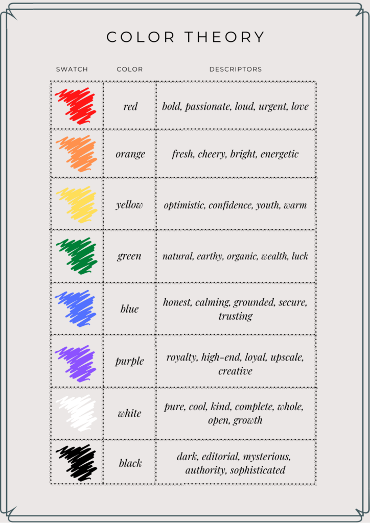
- Red: bold, passionate, loud, urgent, love
- Orange: fresh, cheery, bright, energetic
- Yellow: optimistic, confidence, youth, warm
- Green: natural, earthy, organic, wealth, luck
- Blue: honest, calming, grounded, secure, trusting
- Purple: royalty, high-end, loyal, upscale, creative
- White: pure, cool, kind, complete, whole, open, growth
- Black: dark, editorial, mysterious, authority, sophisticated
Do you find any similarities between the adjectives you like and the colors they are associated with? We hope so! Then you’ll know you’re on the right track.
Next, let’s put these colors together into a cohesive palette.
Selecting a color palette
If you’ve already created a visual branding style guide for your brand, you may be able to skip this step and jump straight into the next section, but we recommend reviewing this process in case you want to revisit your color palette.
While choosing a color you naturally gravitate toward and think your audience will love may not seem like a difficult decision, finding a way to blend all of those colors into a cohesive set may be more challenging. We’re here to help!
Before we go any further, let’s discuss the design tips most graphic designers follow when creating color palettes.
The first is to start with a single color and choose a few different shades or tints of that color. We usually recommend including two to four shades depending on what works best for your brand and quiz. There is usually at least one dark, medium, and light shade of the main color.
If you stopped there, people would call this a monochromatic color scheme. That’s because you have only chosen one main color, but if you decide to include other colors that seem to effortlessly blend well together, there are a few additional color schemes you can create.
Complementary color schemes include colors that are opposite to each other on the standard color wheel. For example, you could pair a lighter shade of orange with a darker shade of green.
Analogous color schemes are colors that are typically within the same family and found right next to each other on the color wheel. For example, shades of yellow and green may look great together.
Triad color schemes, much like complementary, look at pairing colors from across the color wheel. Only this time, instead of pairing with the one opposite color, they create the scheme by pairing with the three colors that are diagonally across from each other. This almost makes a triangle shape, hence the name.
There are other color schemes you can research here, but this gives you a great foundation. You may also want to include an additional pop of color that is only used for strong calls-to-action, buttons, links, and more, but it’s ultimately up to you.
Taking all of this knowledge into account, we created a sample color palette using the complementary color scheme to show you an example of how it all works together.

Can you see how these colors seem to wonderfully go together? Now you know the art and science behind how this works!
Other visual elements to enhance your quiz design
Defining your color palette is just the start of putting together your quiz design!
Don’t worry! You’ve made it halfway through the DIY design process already and you’ll be ready to design your quiz after following a few more steps. Let’s keep the momentum going as we discuss the last visual elements you’ll need to incorporate into your design.
Typefaces or fonts
In your quiz, it’s not only about the words you write but also how they appear. Designing a great quiz means paying attention to the fonts you use. It’s best to use a consistent font for your entire brand so you continue to offer that well-sought after, cohesive look.
First, you’ll need to understand what kind of font your audience will love. There are hundreds of fonts you can choose from in our Interact quiz building platform, not to mention the thousands of premium fonts available across the internet.
So how do you go about selecting the right font?
Let’s start by taking font choices out of the equation and taking a step back to assess the different types of fonts that already exist. Think of it as separate categories describing a specific set of characteristics each typeface has.
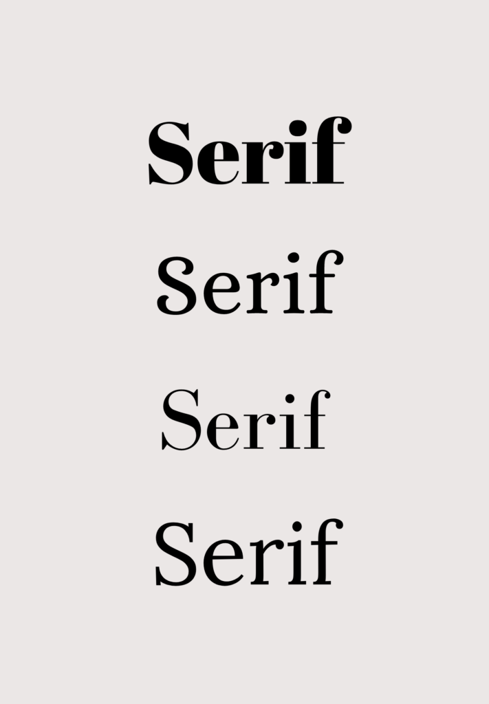
Serif fonts are one of the oldest typefaces, but that doesn’t mean you can’t find a modern option! Serif typefaces are known for their “small feet,” meaning each letter has a small stroke at the top and bottom. These are commonly used in logos and boldly highlighted in marketing materials where large details can be shown and appreciated. Serif fonts are known for being better read in print, so it’s commonly used in newspapers, magazines, and more. It’s one of the most popular font styles in the world, making it an instant classic for many quiz creators.
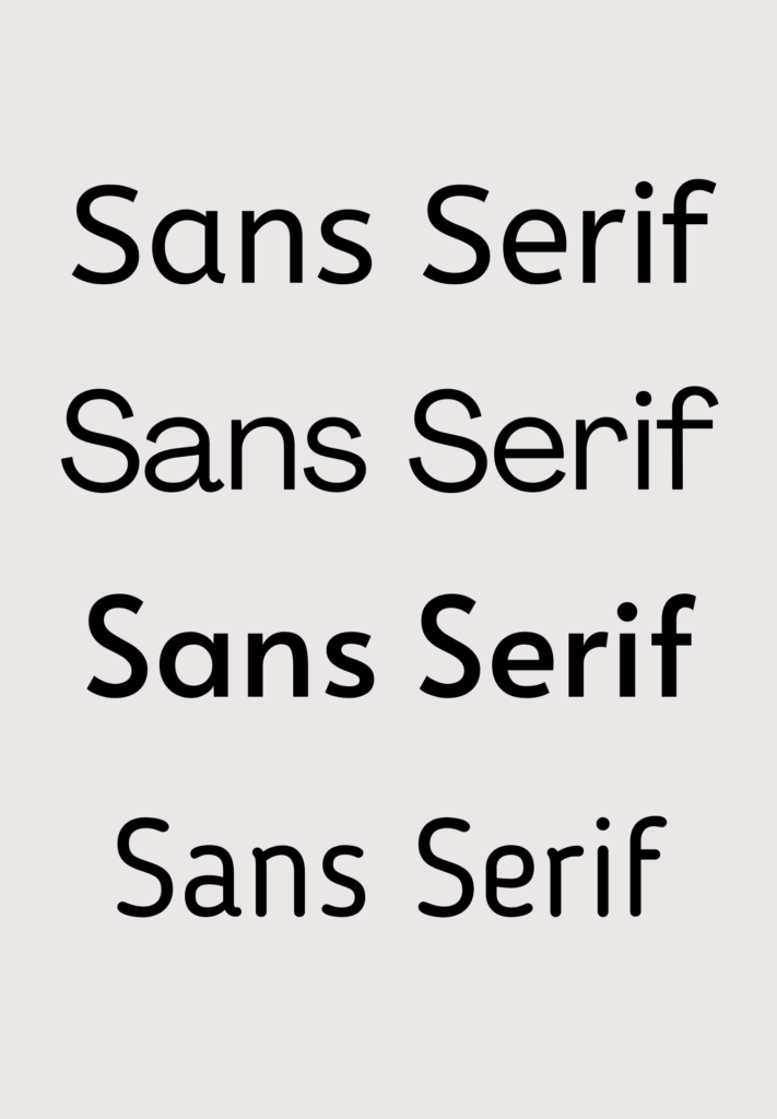
Sans-serif fonts do not feature the same “small feet” look that serif fonts do. Designers originally created sans-serif fonts who wanted a more clean and modern look. Their clean, straight lines characterize these typefaces. Because of their difference, many businesses will pair a sans-serif font with another serif font to fuse both looks into their brand, but it’s up to you to decide which fonts best fit your brand.
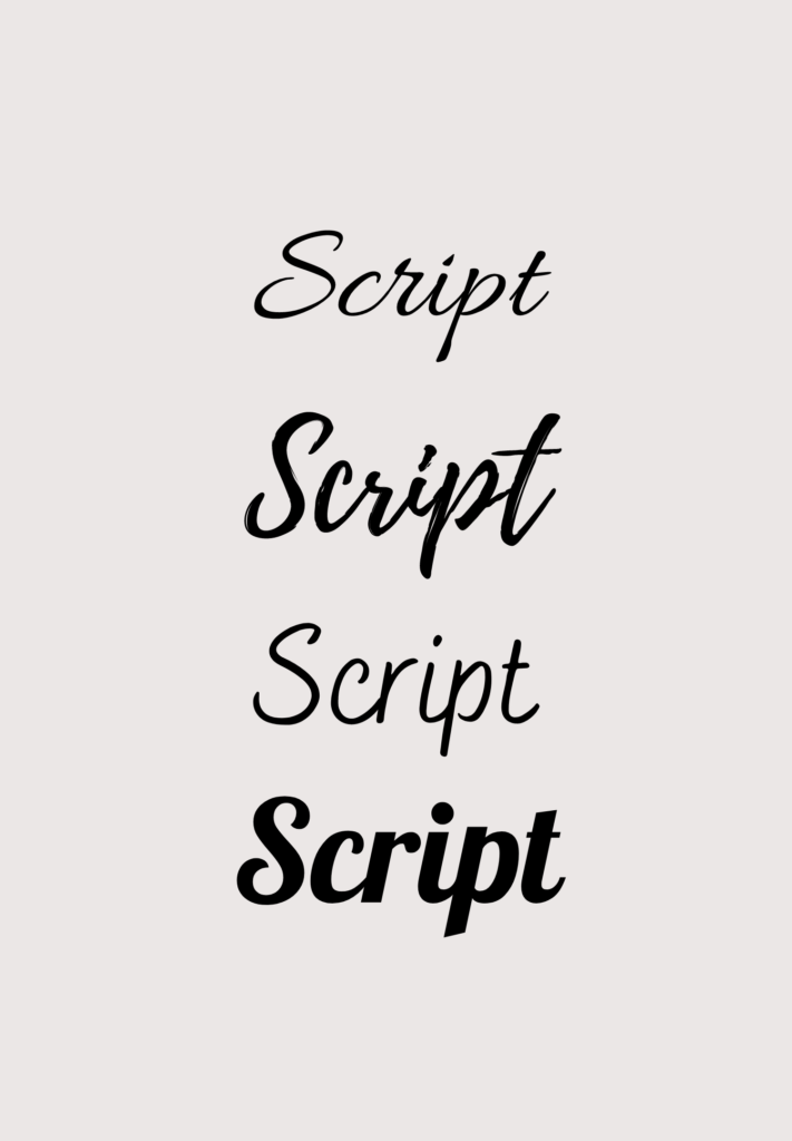
Script fonts are heavily inspired by calligraphy, giving us a feeling of old-world charm. Script letters have fewer flourishes than a serif typeface, but they often connect somewhat seamlessly together. Some script fonts may remind you of cursive handwriting, but that’s considered a more casual style. Many wedding vendors use these fonts to attract brides who want a taste of elegance on their big day, and any brand wanting to create a more regal visual theme with their quiz can also use them.
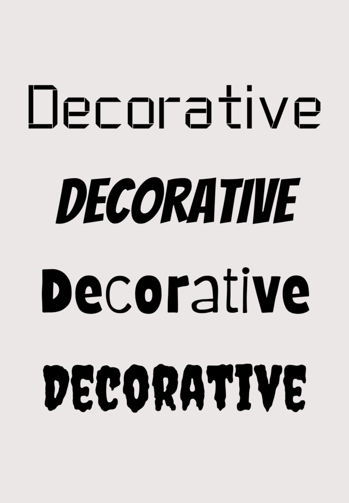
Decorative fonts typically have the most creative freedom, allowing you to adjust how specific letters look without affecting the rest. These typefaces are usually used in trendy logos to create a distinct, one-of-a-kind look. Some decorative fonts may look outdated over time, but they sure are eye-catching! In most cases, it’s best to use these decorative fonts sparingly and simply highlight a company name with the font rather than use it in paragraph text.
If you can’t find the perfect font, don’t worry! Some brands and entrepreneurs will commission the creation of a “custom font” specifically for them. Graphic designers can either craft a digital custom font based on your preferences or they can create a unique handwritten font and later turn it into a digital format.
You might find yourself leaning toward one font style more than the others, but take a moment to think about the companies your target audience loves shopping at.
Do they frequently buy home decor from Anthropologie and West Elm, or from HomeGoods and Cost Plus World Market? Do they prefer Apple or Microsoft, Walmart or Target, and so on?
Depending on what their shopping preferences are, look at each brand’s visuals to assess what styles your ideal customers are already gravitating toward. Do those fonts match the style you were leaning toward? If so, that’s great news! If not, you may want to revisit your customer personas to ensure you understand your customer’s aesthetic.
Now you’ll be ready to choose a font for your quiz design.
Recommended Tutorial: How to Add Custom Fonts to Your Quiz
After you sign up for a free trial and scroll through our font library, ask yourself these core webs before making your selection:
- Is the typeface easy to read at a quick glance?
- How does the typeface make you feel? How will it make your audience feel?
- Is the font readily available for free, or do you need to pay to use it commercially?
All of the fonts in our library are free to use in our quiz app, but please keep the last question in mind if you plan to use the font inside your website and for other marketing materials. It’s a good idea to choose fonts in your quiz that are consistent with the rest of your visual branding.
Now, let’s talk about imagery!
Cover images
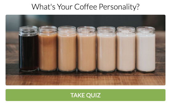
In addition to the title of your quiz, your audience will also see your quiz cover image right away. It’s not surprising, then, for us to say it has to make a great first impression.
Your cover image should catch your audience’s attention and illustrate what your quiz is all about. Once you make sure the subject matter of the cover image is on-point, all you have left to do is ensure you edit it in a style that fits your visual theme.
For example, if you’re an interior designer using a quiz to help people determine what their interior style is, it would make sense to use a stock image of a styled room. For a coach who teaches others about living a minimal lifestyle, the designer would likely include a lot of white space in the minimally designed stock photo.
It’s best to find ways to visually show what your general knowledge quiz is about, even if your topic doesn’t feel inherently visual. This is your chance to get creative!
As you choose a cover image, here are a few best practices to keep in mind:
- If you use a stock photo, try to choose an image that features one smiling person. (Fun fact: 50% of the most viewed Interact quizzes have people in their cover images!)


- If you are building a personal brand and want to be seen as an expert, a smiling headshot might do the trick.

- If you want your image to do the talking, create your very own branded graphic.

- If your topic is new to your audience, use imagery that will educate and intrigue them.

- Make sure your cover image looks great on every device screen, meaning it needs to be a high-resolution image.
You’ll also want to ensure that no one holds copyright to the images you choose. It’s best to use free stock photo sites or choose from our Interact stock library instead of searching on Google so you’re completely in the clear. It’s not worth it to get into legal trouble over a few images.
You can also include your own graphics and photography since you hold the copyright to your own work. This recommendation is relevant for every kind of image you add to your quiz.
Question and answer images
Once you have an eye-catching cover image, it’s time to decide if you want to include question images or answer image options to your multiple-choice quiz. Imagery will keep your audience engaged all the way through your quiz, making every question feel more fun.
The more you use imagery, the more likely you are to hold your audience’s attention so they make it to the end of your quiz, feeling excited to receive their final results. This means you’ll gain more email subscribers from your quiz and make more sales from your follow-up email sequence!
Now that you’re sold on including question and answer images, how do you decide between the two options? It would be too overwhelming to include an image for the main question along with images for every answer option, so you’ll want to choose one or the other. We’re here to help you make the decision much easier.
Question images are usually best if each question has a main theme that can be easily illustrated in one image. If you review your multiple-choice answer options and they feel difficult to find images for, this might be a sign to use question images.
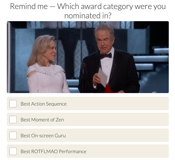
If you want to add more pop culture and a dash of fun in your general knowledge quiz, you could even use GIFs instead of question images.
GIFs usually are best when used for quiz questions rather than answers since they’ll be seen in a larger format. If you include GIFs in your answers, small boxes will display them. You could see multiple GIFs in one window as distracting and overwhelming. That’s why it’s best to choose one per quiz question.
Answer images, however, are a great option if you want to show different visuals paired with each answer option. Around 90% of the top 100 most viewed Interact quizzes have answer images, so you could say they work pretty well. (That’s an understatement!)

If you choose to include images or GIFs in your answer options, try to keep them in a similar style. It will help your DIY quiz design look more professional and consistent.

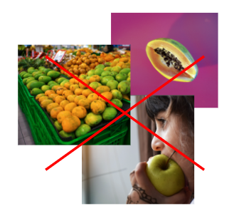
You want your answer images to keep your audience engaged with each quiz question so they can move on to the next without being distracted by imagery that feels too busy.
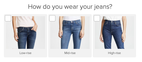
When using answer images, keep the answer text relatively short. No only will it make your quiz look better, it will also decrease the amount of mental work your audience needs to do in order to take in all of the imagery and information at once. If you are creating a trivia quiz, keeping it brief will also help your audience find the correct answers without getting distracted.
This is especially true if you are including multiple answer images. If you only use text, you can be more thorough in your answer copy.
Results images
You’re almost done! The last images you need involve your final quiz results. If you haven’t written them quite yet, you’ll want to follow along with the exercises below. Your customer personas will also come in handy in this stage.
Recommended Tutorial: How to Write Quiz Results
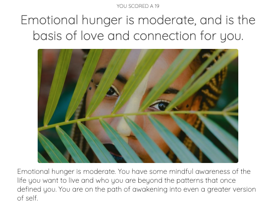
You may notice when you create each quiz result that you have the option to include a result image. This may be optional on our platform, but we see it as a very important element of your quiz design.
All of the top 100 most viewed Interact quizzes included result imagery. That’s right, ALL of them! That’s why we highly recommend you choose a stock image from our library or upload your own graphic to accompany your quiz result description. Again, make sure to check the copyright laws of the image you want to use before you incorporate it into the multiple-choice quiz.
If you aren’t sure which result images you should choose, here are a few examples to inspire you along the way:
- Find a stock photo that illustrates a core personality trait or quality of each audience member’s quiz results.

- Show a hopeful image of what someone’s ideal life could look like or what someone looks like when they’re at their best with a stock image.

- Select an image that creates more intrigue and feels a little mysterious, convincing your audience to continue reading their results and taking action on any next steps.
- Choose a well-known celebrity who matches each quiz result, but make sure to highlight someone your audience member would love to be compared to.

Once you’ve chosen one image or graphic for each result, you can put the final touches on your visual theme before you get ready to launch your first quiz. How exciting!
6 visual theme examples to inspire your quiz design
If you’re still playing around with certain visual elements, going back and forth about what visual theme you want to pursue, or focused on getting your design just right before you hit the “publish” button, don’t worry.
We have a few visual theme examples that may inspire your quiz design or help you feel more confident in the route you’re headed. We’ll break down the strategic decisions that went into each visual theme and who it’s the perfect fit for.
You may just find exactly what you need to get started!
Keep in mind that each quiz design template comes with a variety of colors, all with easy-to-use HEX codes that you can use inside our quiz app. All you need to do is copy and paste the six-digit HEX code (like #fd7f7e, for example) and save the color. That way, all of your colors stay perfectly on-brand and are aligned with the rest of your design.

| Visual theme: Feminine Colors: Warm and cheery red-oranges mixed with grounded and calming blues Font: Serif typeface (also italicized in some sections for emphasis) Perfect fit for: Coaches, creative freelancers, educators, and influencers who are targeting a largely female audience |
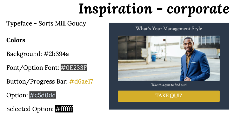
| Visual theme: Corporate Colors: Dark yet professional main colors with high-contrast pops of yellow Font: Serif typeface Perfect fit for: Agencies, corporations, and nonprofit organizations who want to cater to a professional audience |

| Visual theme: Fresh Colors: Bold pops of red-orange with equally energetic and calming shades of blue Font: Sans-serif typeface Perfect fit for: Coaches, speakers, authors, freelancers, and any creators who want to attract audience members with a youthful energy |
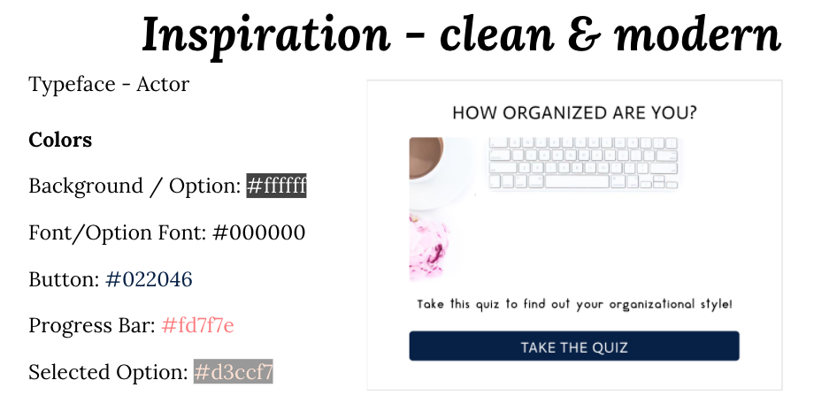
| Visual theme: Clean & Modern Colors: Rich shades of blue with lots of white space in the minimal design Font: Sans-serif typeface Perfect fit for: Bloggers, influencers, and marketers who want to appeal to a mass audience without looking overly trendy |
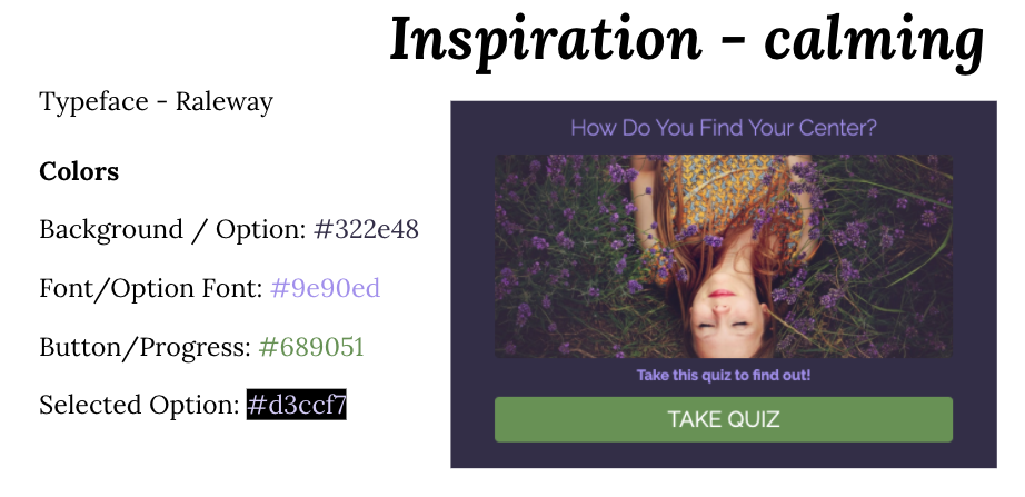
| Visual theme: Calming Colors: Earthy shades of green with luxurious purples Font: Sans-serif typeface Perfect fit for: Service providers and eCommerce shops who want to create a high-end look with their quiz design that also feels natural and organic |

| Visual theme: Rustic Colors: Pops of understated yellow and dark blue with a bold red Font: Serif typeface Perfect fit for: Bloggers, content creators, and personal brands who want to attract people who love to travel, explore the world, and live a care-free lifestyle |
Get started by designing your own quiz
Now you have everything you need to make a statement with your quiz design!
Here’s a refresher of the steps we just covered:
- Choose a visual theme that fits your audience and industry
- Create a color palette using the principles of color theory
- Choose fonts based on the typeface that will attract your target audience
- Upload or select imagery for your quiz cover, questions, answers, and results
All that’s left to do is to sign up for a free trial of Interact and design your own quiz for free!
